Edit Content

FAT FROG

Branding & Design Studio
Fatfrog Logo Gif

Fat Frog Branding & Design Studio, We specialize in crafting unique, high-quality packaging solutions that not only Safeguard your products but also enhance your brand’s identity.

Brand Guidlines By Fatfrog Branding & Design Studio

Palasa Yoga

Brand Identity Design

Brand Guidlines

Brand Strategy 

Communication Creative Design

Brand Naming

“Move with Intention. Live with Purpose.”

At Palasa Yoga, we believe that wellness is a journey guided by harmony within the body, mind, and the natural world. Inspired by the palāśa tree, known for its vibrant resilience and deep cultural symbolism, our brand embodies balance, strength, and transformation. Our identity reflects a return to mindful movement and inner stillness. With serene earth-toned aesthetics, organic textures, and gentle, flowing motifs, Palasa Yoga offers a space where you can reconnect with your breath, your body, and your purpose. 

Branding Importance

Branding is more than just a logo or color palette it’s the soul of Palasa Yoga. It tells our story, reflects our values, and sets the tone for every experience we offer. In a world full of wellness options, strong branding helps Palasa Yoga stand out as a sanctuary rooted in authenticity, mindfulness, and nature-inspired calm.

Brand Journey

Artboard 1 1 1

Every meaningful journey begins with a moment of stillness and intention and ours began as FatFrog Branding & Design Studio, a vibrant, fearless space where creativity moved freely and boundaries dissolved. At FatFrog, we dared to be bold, celebrated curiosity, and infused every project with spirit and originality. We shaped brands with character and color, disrupting the norm and redefining identity.

But as our journey deepened, so did our purpose.

We realized we weren’t just creating brands we were creating space for transformation. What began as expressive design evolved into a deeper calling: to foster presence, balance, and healing. Our work had taken on a rhythm intentional, grounded, spiritual. It was time for a name that reflected this new energy and honored the sacred journey of mind-body connection.

Rooted in ancient wisdom, Palasa a sacred tree known for its healing and spiritual properties embodies everything we stand for: rooted awareness, graceful strength, and radiant inner light. From creative beginnings to conscious evolution, Palasa Yoga reflects the core of our mission to offer a sanctuary where individuals can reconnect with themselves, realign with nature, and rise with renewed energy. It is more than a name; it is a practice, a presence, and a path to wholeness.

About Palasa Yoga

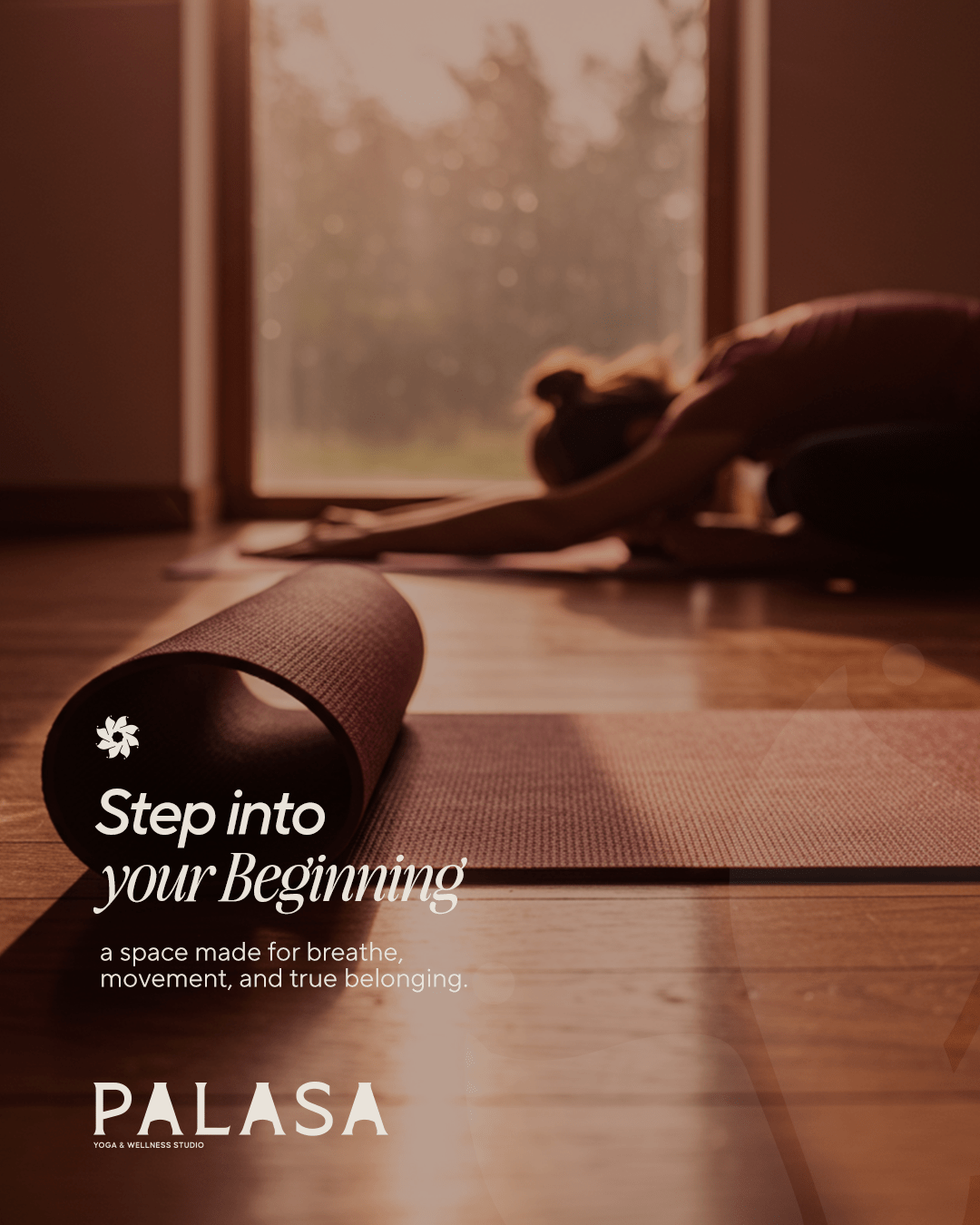
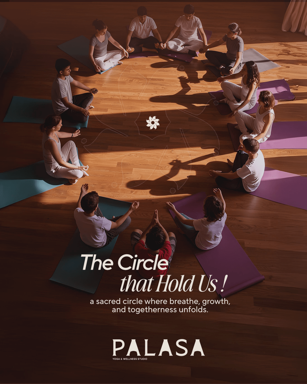
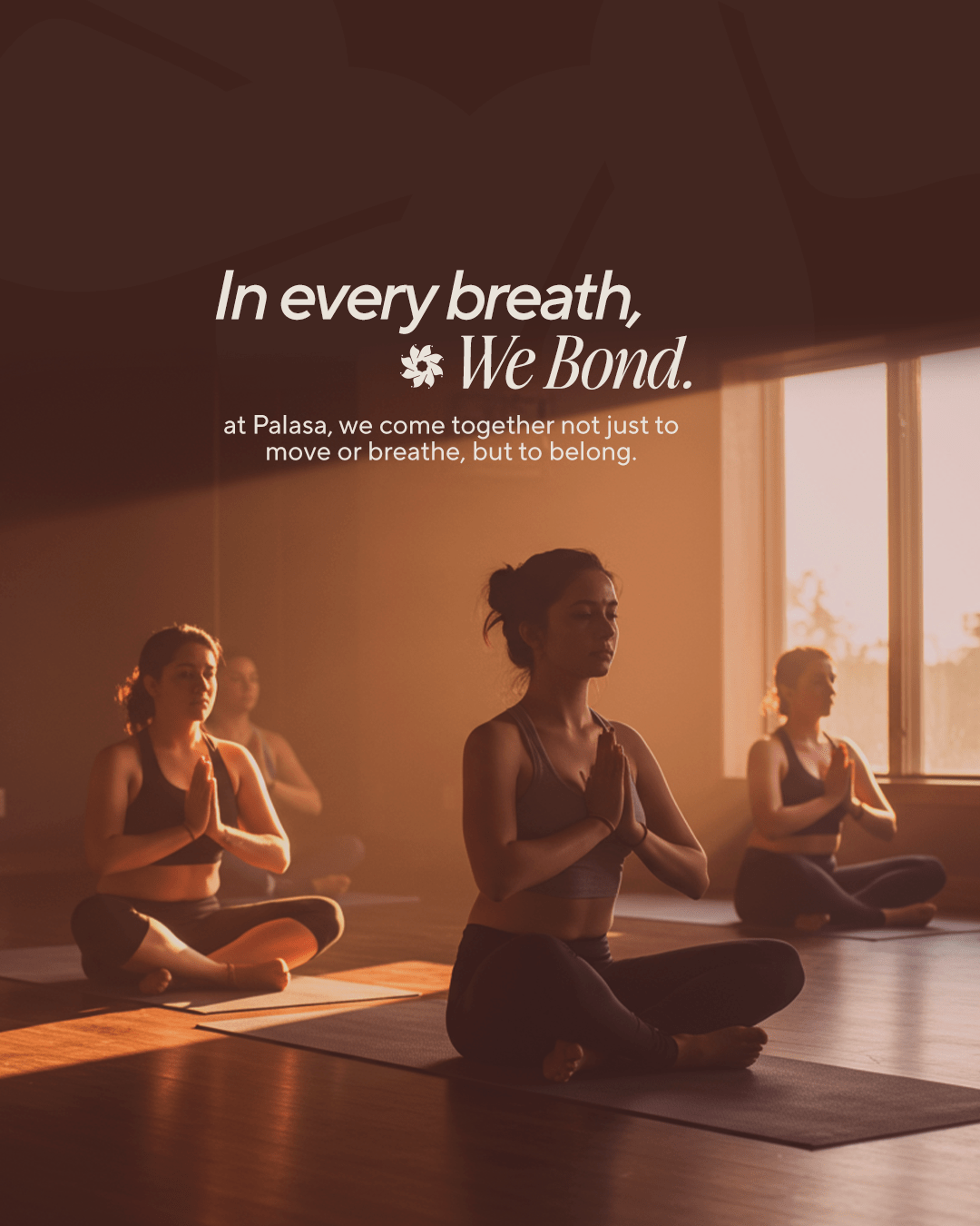
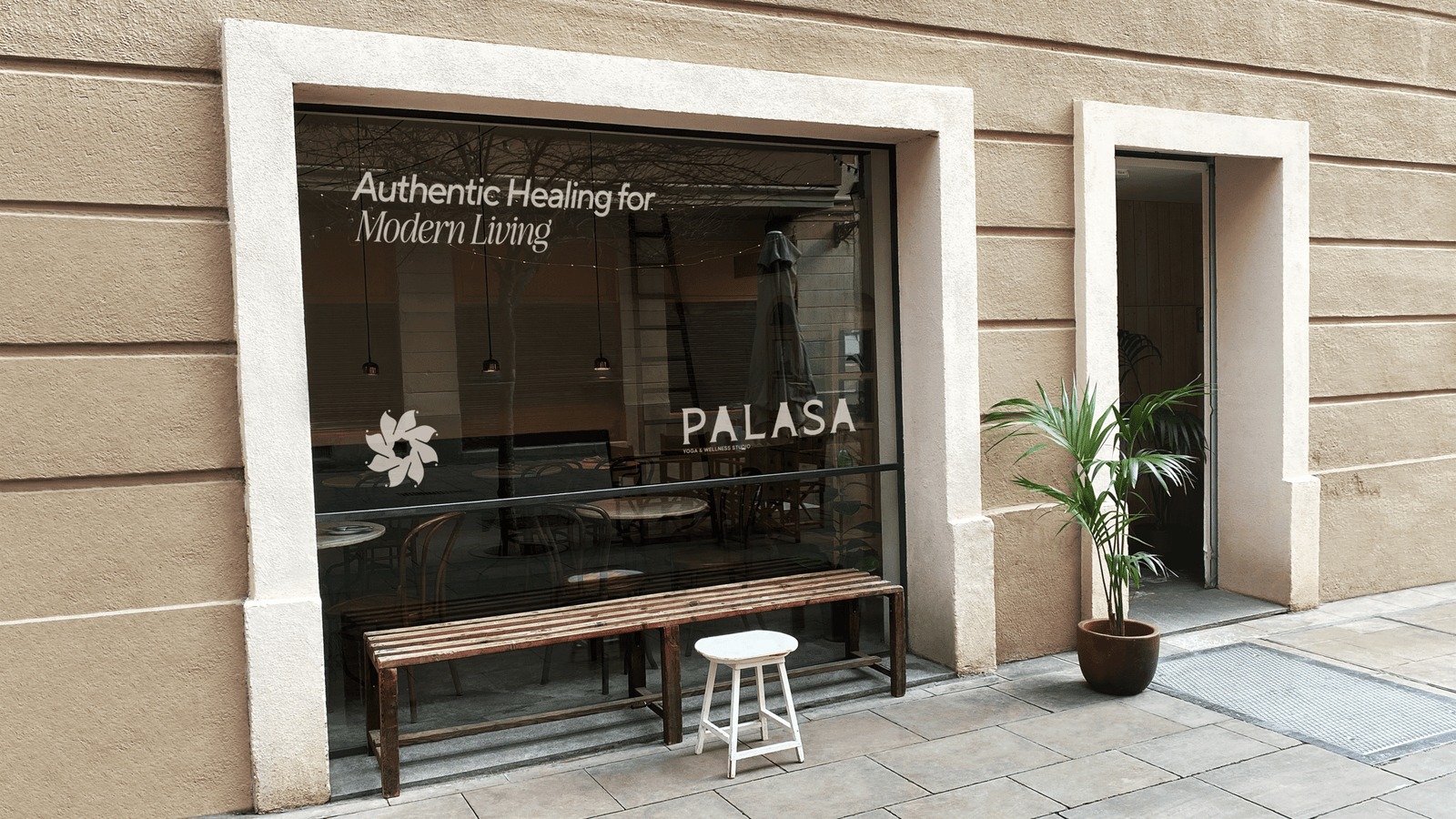
Palasa Yoga & Wellness Studio is a holistic space where the ancient practices of yoga and Ayurveda meet the needs of the modern individual. Built on authenticity, compassion, and growth, Palasa creates a sanctuary for mind, body, and spirit. The brand stands for accessible, integrated wellness, promoting vitality, balance, and inner peace in a fresh, welcoming environment, With thoughtfully designed classes, experienced instructors, and a deeply grounded atmosphere, Palasa Yoga is more than a studio  it’s a journey inward. Whether you’re stepping onto the mat for the first time or deepening your existing practice, we invite you to reconnect with your breath, rediscover your strength, and realign with your natural flow. At Palasa Yoga, you are not just practicing yoga you are cultivating peace, purpose, and presence.

Artboard 4 2

Strategy Statement

The creative direction for Palasa Yoga centers on guiding the journey of inner balance and self-discovery through a blend of serenity, natural energy, and mindful elegance. Visually, the brand will draw inspiration from the natural world and ancient wisdom soft earthy hues like sage green, warm sand, and muted clay paired with gentle gold accents to evoke grounding, harmony, and spiritual clarity. Typography will merge tradition and simplicity, using a graceful serif font to express rooted wisdom and a refined sans-serif for clean, modern readability. Imagery will showcase real, peaceful moments of practitioners in flow meditating, breathing, and moving with intention in naturally lit, calm environments. The tone of voice across all content will be soothing, introspective, and affirming resonating with both seasoned practitioners and beginners seeking mindful transformation. Organic symbols such as leaves, flowing lines, mandalas, and sacred geometry will subtly convey wholeness, growth, and universal energy. Palasa Yoga’s creative identity will embody more than just a wellness space it will reflect a sanctuary where the body, mind, and spirit are invited to return to their natural rhythm and thrive in mindful harmony.

Brand Purpose

Palasa exists to inspire healthier living through the holistic integration of yoga and Ayurveda. The studio is committed to providing a nurturing environment that supports physical strength, mental clarity, emotional resilience, and spiritual growth.

Brand Vision

Palasa envisions becoming a recognized and trusted chain of holistic wellness spaces across cities within the next 3 to 5 years. The brand seeks to cultivate communities rooted in mindful living, authentic practice, and genuine personal transformation & serves audience of Modern thought process.

Brand Purpose

The Palasa experience is built on five core values that guide every action and interaction

Our Core Values

Picture22

Dedication – Consistent, focused pursuit of excellence.

Creativity – Innovation rooted in authenticity.

Hygiene – Upholding purity, safety, and care in every space.

Growth – Supporting personal, spiritual, and community development.

Kindness – Leading with empathy, understanding, and generosity.

Brand Identity

Direction

Concept – A soulful, traditional, and community-driven wellness brand inspired by spiritual practices, rituals, and holistic healing.

Warm & Earthy Tones – Gold, warm browns, soft greens, and beige for a natural, healing atmosphere.

Mark –The mark should be scalable, simple, and deeply rooted in yoga. It must work across mediums and reflect balance, breath, and alignment, while staying iconic as the brand expands.

Typeface – The typeface should be custom and inspired by the essence of yoga. It must feel calm, grounded, and adaptable able to scale seamlessly across products, services, and future brand segments.

Holistic Rituals & Meditation – Visuals of deep meditation, mindful practices, and Ayurveda.

Screenshot 139
Picture 1

Sketching

Sketching in yoga entails drawing representations of yoga postures, often using stick figures, to depict asanas and their transitions. This method serves as a visual aid for practitioners and instructors to plan, remember, and communicate sequences effectively.

Sketching for Palasa Yoga is a mindful and creative practice that involves visually capturing yoga poses and sequences through simple illustrations. This approach aids in understanding body alignment, enhancing memory retention, and deepening one’s connection to the practice.

Identity Concept

“Move with Intention. Live with Purpose.”

The Palasa Yoga & Wellness Studio logo is a visual expression of balance, inner harmony, and holistic well-being

Picture2

Inspired by the Palash Flower

The symbol takes inspiration from the Palash flower—a blossom deeply rooted in Indian culture and known for its healing and spiritual significance.

A single custom petal was crafted and repeated eight times in a circular motion, forming a balanced mandala-like mark. This repetition of eight also symbolizes the 8 limbs of yoga (Ashtanga)—a foundational philosophy in the practice of holistic wellness.

Screenshot 140

Identity Typeface Usage

The wordmark “PALASA” uses a refined, elegant serif typeface chosen for its balance of strength and softness, echoing the dual nature of yoga practice: grounded and gracefull.

Colour Palette

The Palasa Yoga color palette is thoughtfully curated to reflect the brand’s core values of groundedness, tranquility, and natural harmony. Drawing inspiration from earthy elements and serene landscapes, the chosen colors aim to evoke a sense of balance, warmth, and mindful simplicity

Primary Color: Palasa Earth Brown (#753D26)

This rich, organic brown embodies stability and reliability, connecting the brand to the earth and nature. It evokes feelings of warmth and coziness, creating an inviting atmosphere for clients. The color reflects a down-to-earth and authentic brand personality, resonating with the practical aspects of yoga practice.

Secondary Color: Palasa Sand Beige (#E7E1D6)

This soft, muted beige provides a sense of calm and relaxation, essential for a tranquil yoga environment. It acts as a neutral backdrop, allowing other elements to stand out while maintaining visual harmony. The color conveys sophistication without being overpowering, aligning with the minimalist aesthetic of the brand

Screenshot 141
Screenshot 142

Brand Communication Design

Typography Hierarchy in Communication

Aa!

At Palasa, we come together not just to move or breathe but to belong.

TT Norms Pro

Palasa’s brand communication employs a thoughtful pairing of typefaces to balance clarity with elegance, ensuring every message reflects the studio’s calm, elevated, and grounded personality.


Primary Typeface – TT Norms Pro A modern, clean, and highly legible sans-serif font. TT Norms Pro is used for body copy, captions, and functional text across digital and print applications. Its geometric structure provides clarity and neutrality, supporting clear communication without distraction.

Step into Your Beginning

At Palasa, we come together not just to move or breathe—but to belong.

Awesome Serif             Aa!

Visual Hierarchy Example

Headings: Serif or calm sans-serif, size XL

Subheadings: Medium weight, size M

Body text: Clean, light, comfortable to read.


Application Tips

Keep line spacing open, avoid dense paragraphs.

Use minimal emphasis – avoid underlines or too many bold words.

Brand Application

Social Media Design

Logo: Icon-only preferred as profile picture.

Posts: Consistent layout with brand colors and fonts.

Post types: Quotes, class info, reminders, testimonials Keep copy short and soothing.

Social Link

Artboard 1 1 1
Artboard 3 2

Creative Direction

The creative direction for Palasa Yoga centers on illuminating the path of inner growth and holistic well-being through a blend of warmth, elegance, and mindful simplicity. Visually, the brand draws inspiration from nature and light soft earthy tones paired with green, yellow, and blue highlights to symbolize vitality, balance, and spiritual awakening. Typography will reflect a harmony between tradition and modern awareness, using the Mosvita font to convey grounded wisdom and heritage, paired with clean sans-serif elements that represent clarity, openness, and flow. Imagery will focus on serene, emotive moments of individuals engaging in yoga, meditation, and breathwork capturing mindfulness, presence, and energy in natural, tranquil settings. The tone of voice across all content will be calm, empowering, and reflective, speaking to the inner journey of self-awareness and the outward practice of compassionate living. Symbolism such as leaves, sunrises, flowing lines, and sacred geometry will gently reinforce the essence of rooted stillness and radiant transformation. Palasa Yoga’s creative identity will reflect not just a wellness brand, but a sacred space where each practitioner is gently guided to align body, mind, and spirit and to thrive with intention, grace, and inner light.

PALASA

Yoga and Wellness Studio

Artboard 1 2
Artboard 6 1
Artboard 5 1

Recent Case Study

Let’s make your business a brand.

Branding Logo