


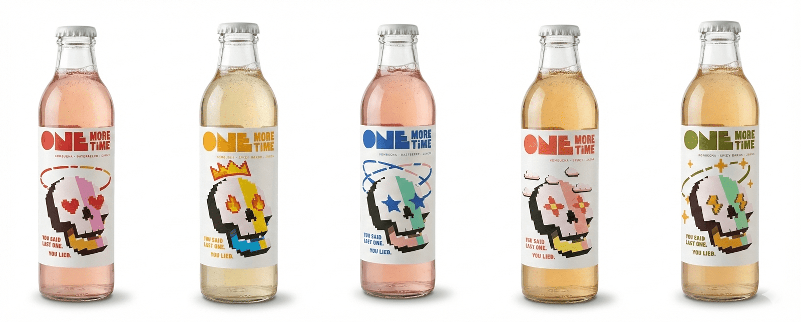
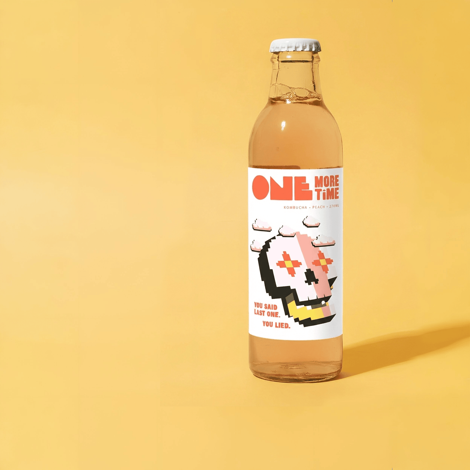
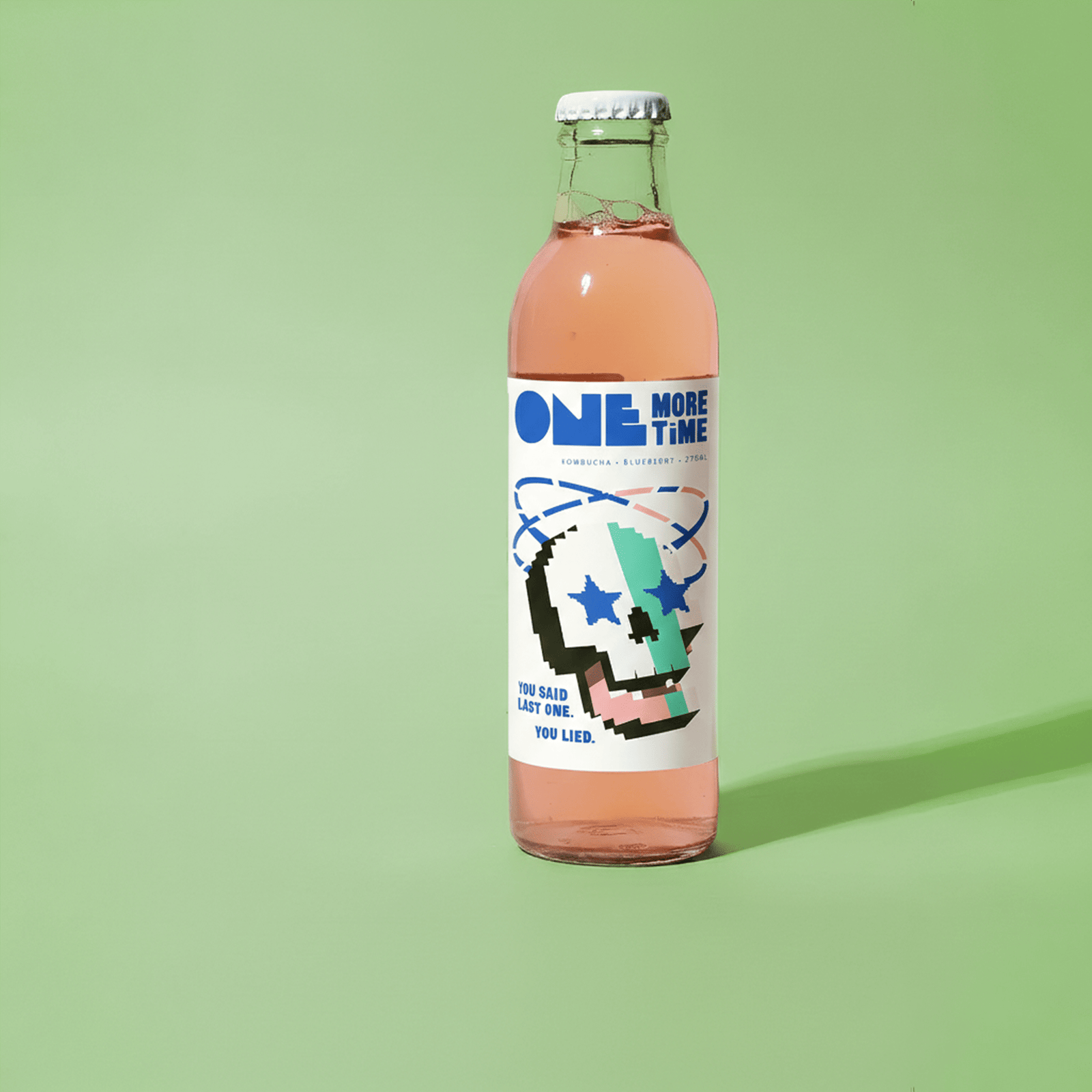
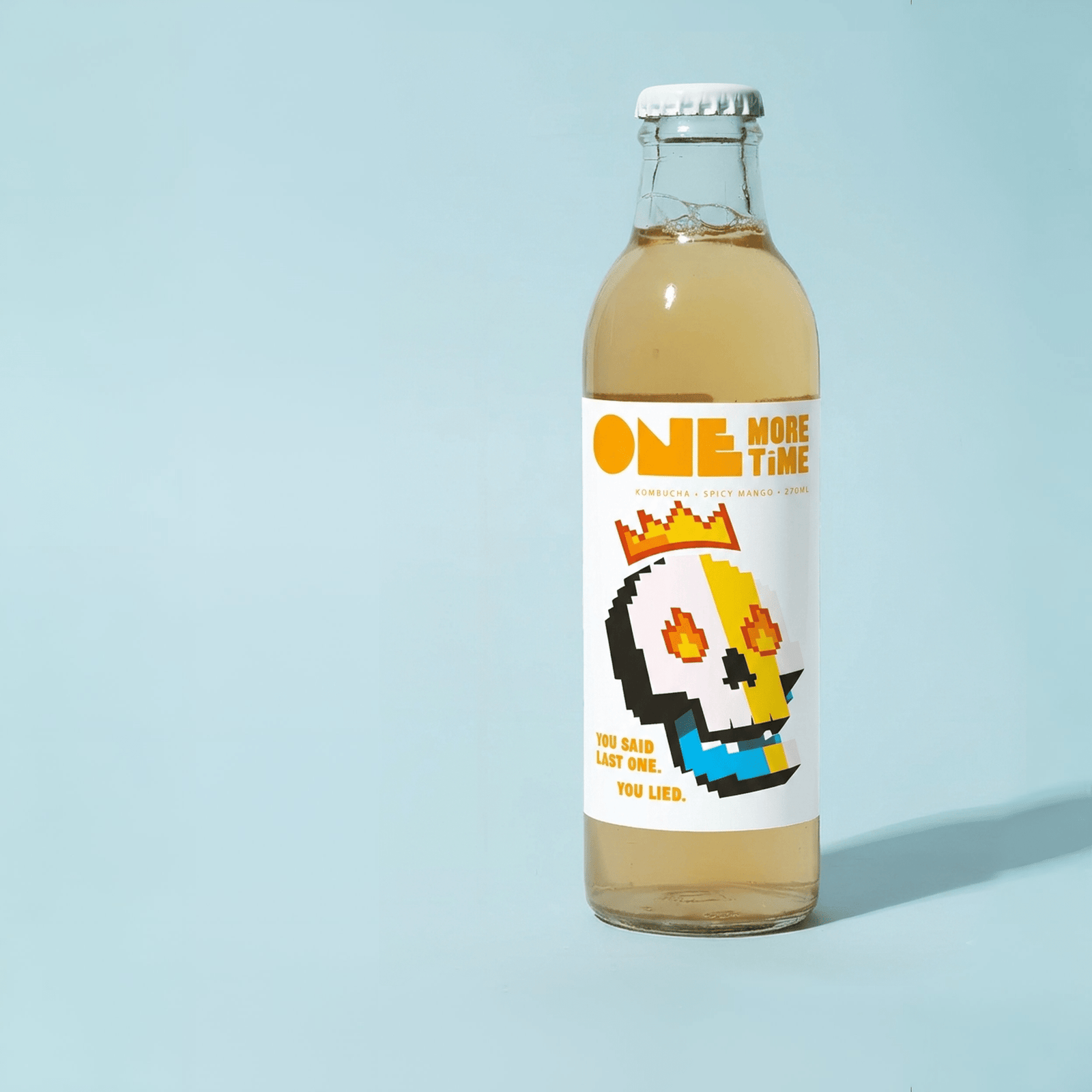
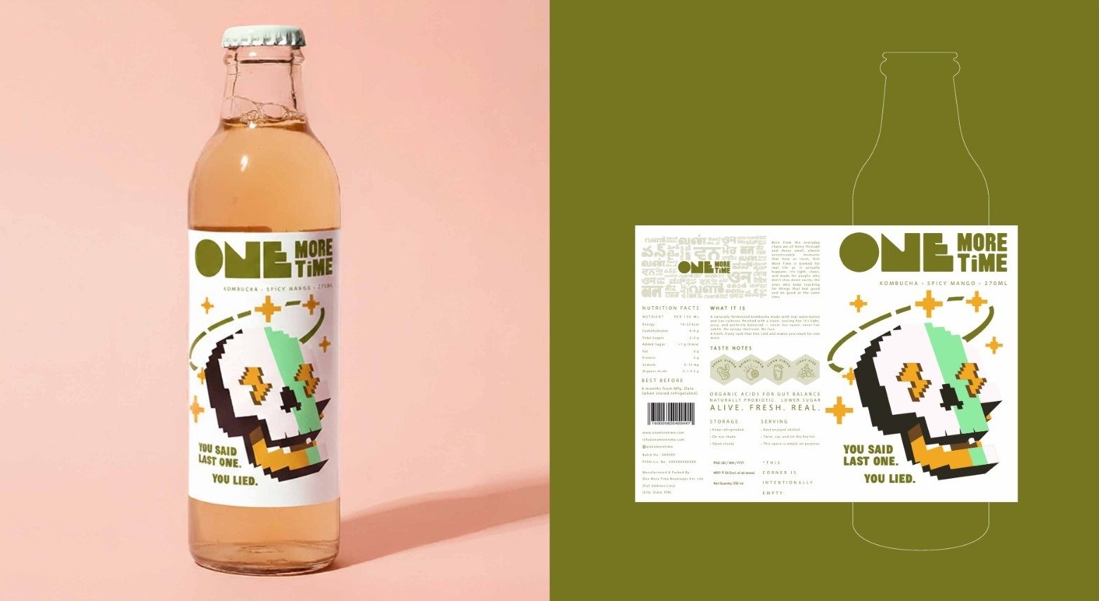
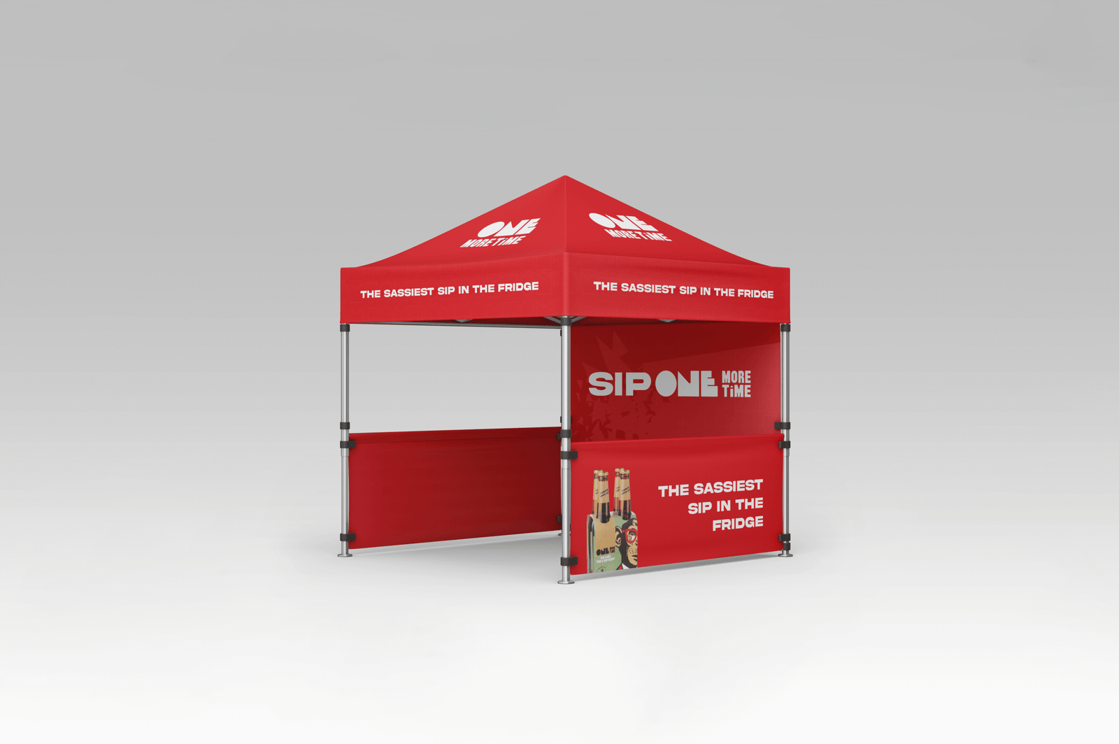
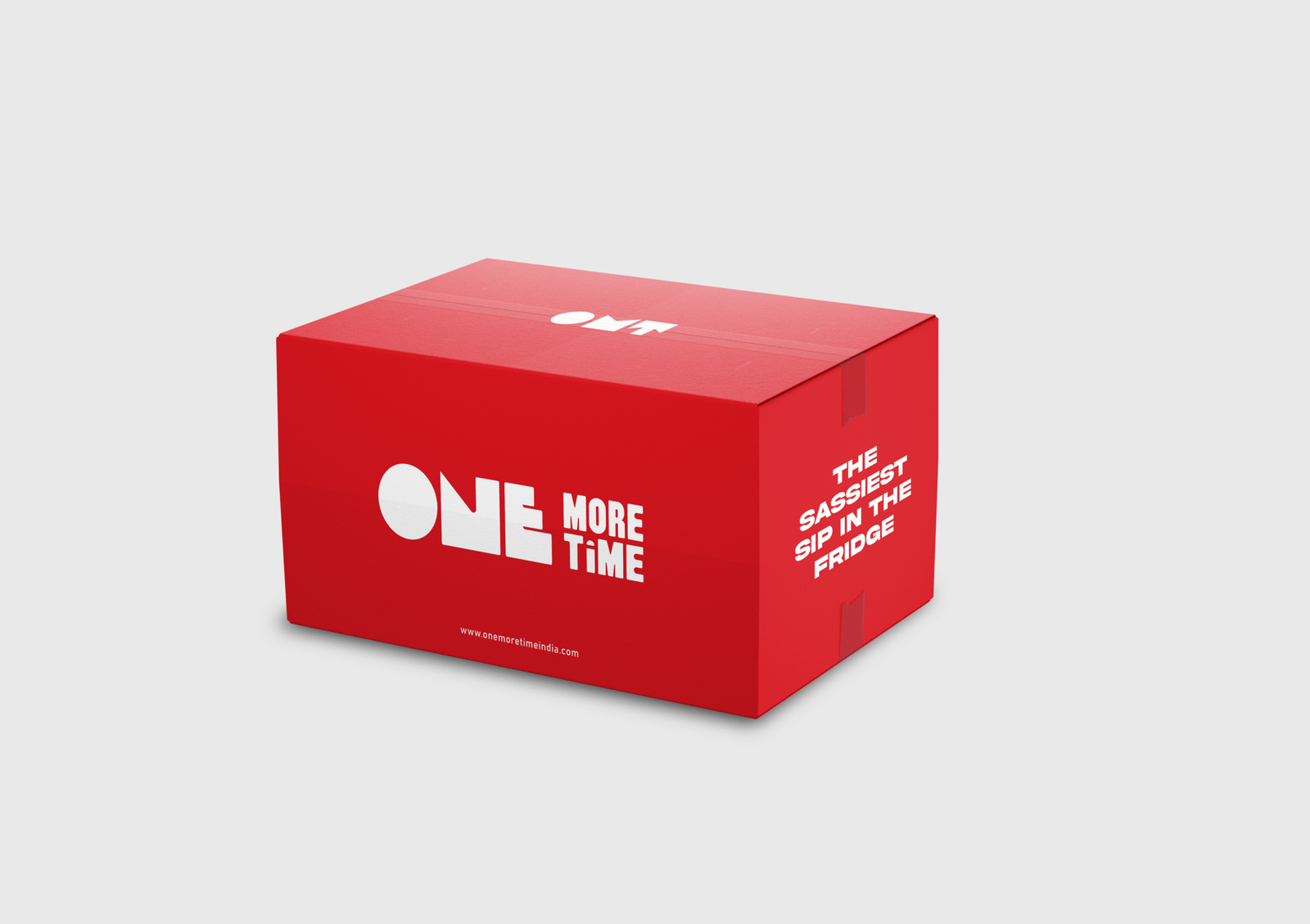
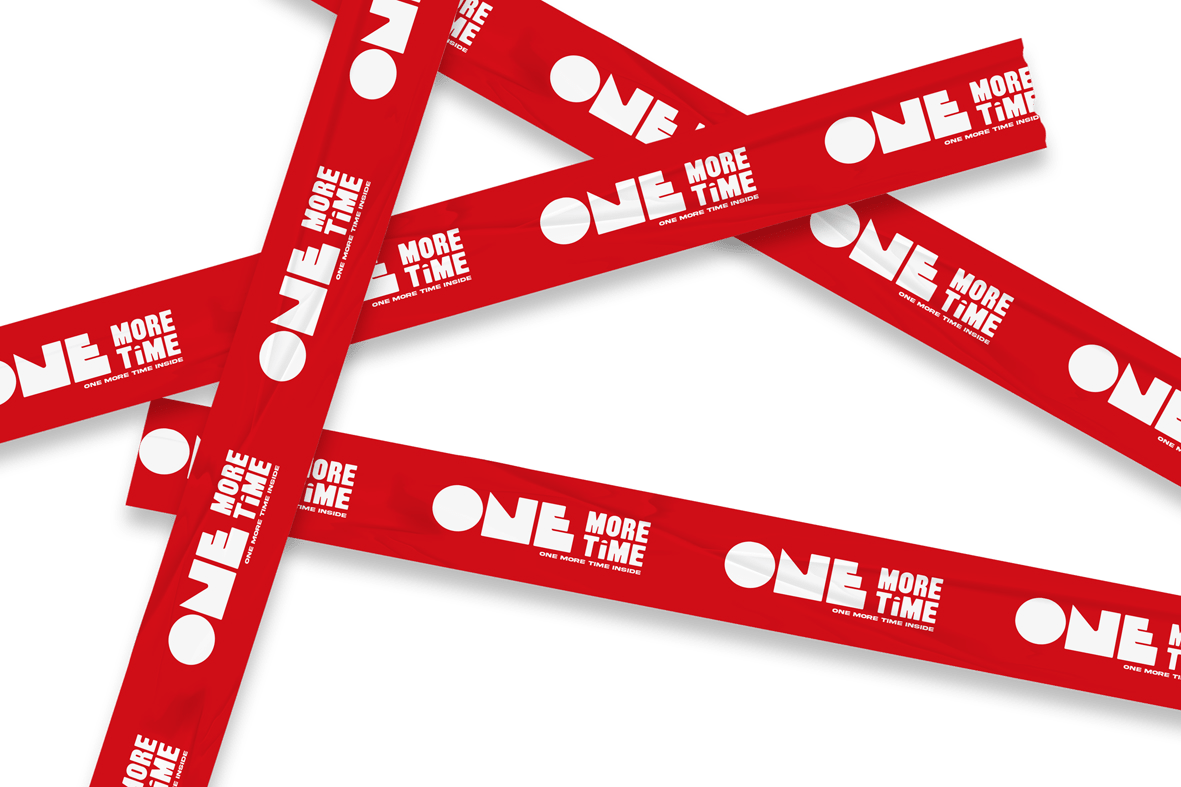
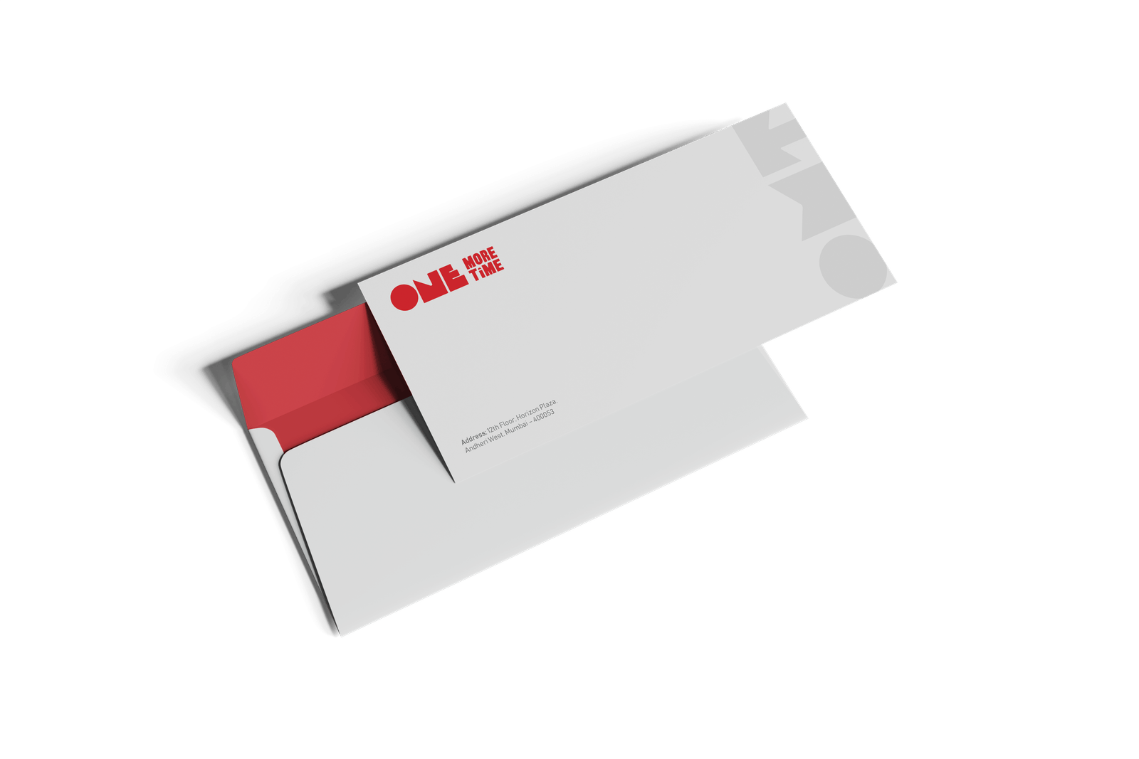
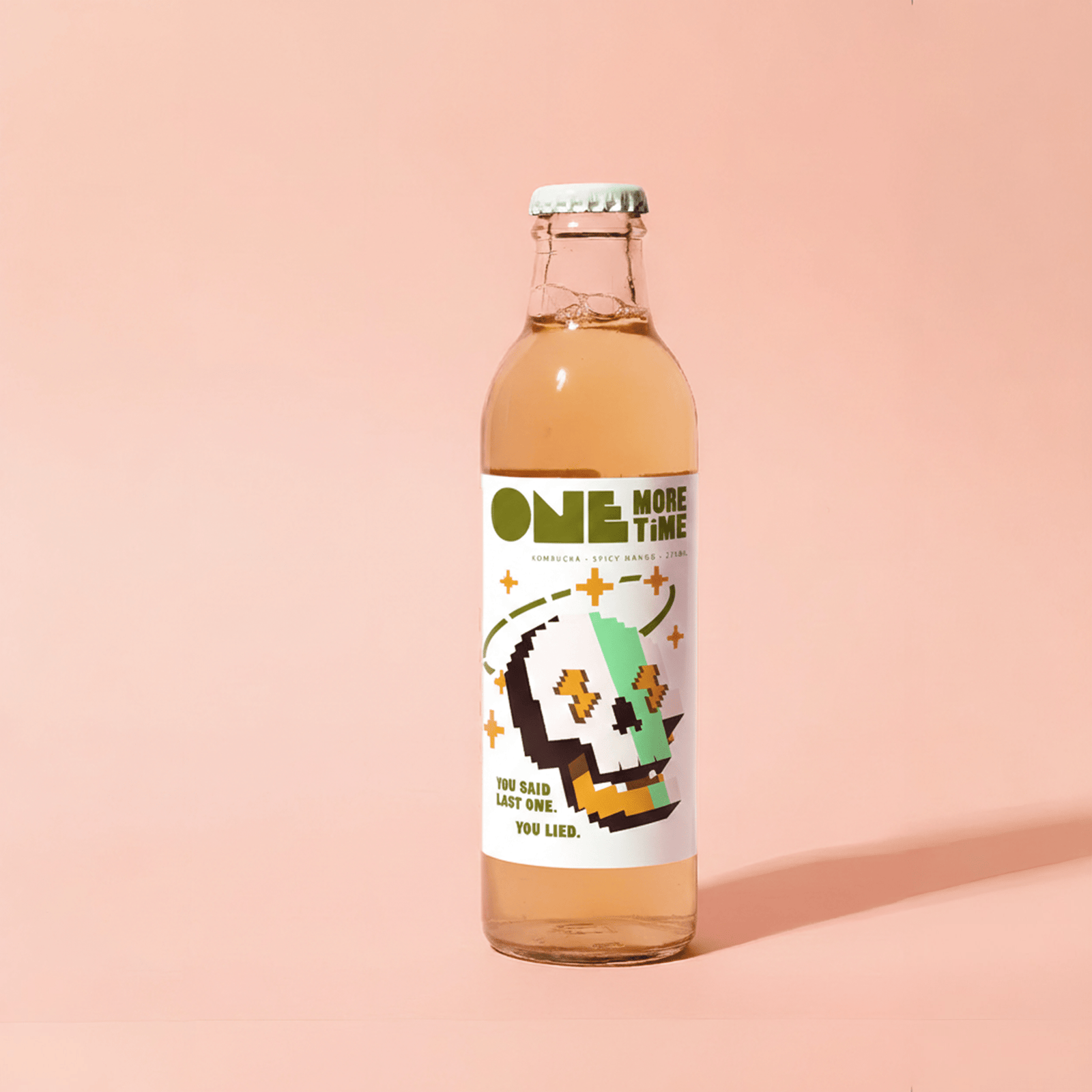
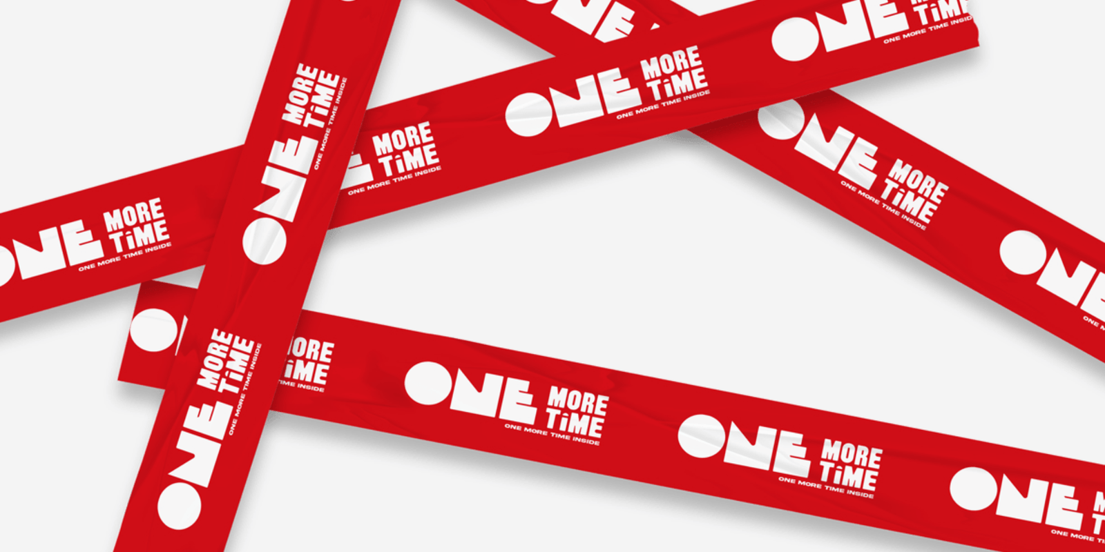
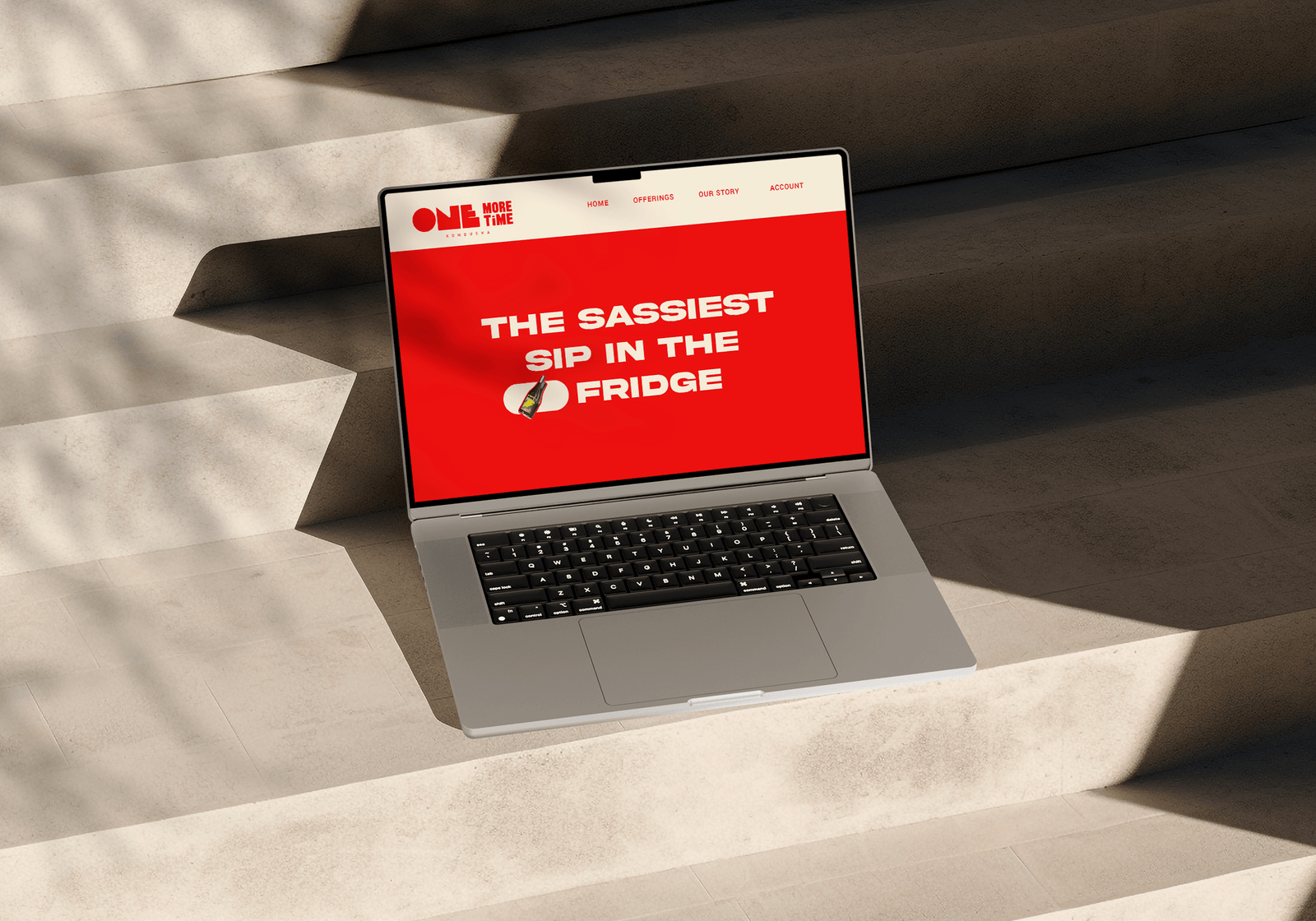
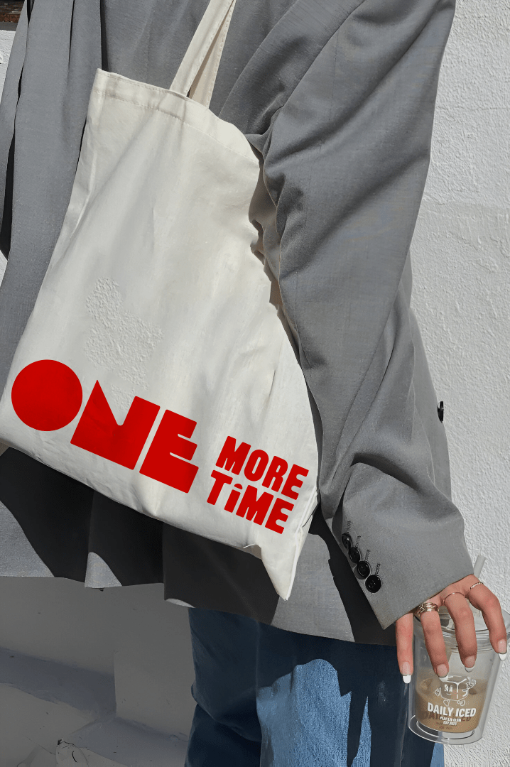
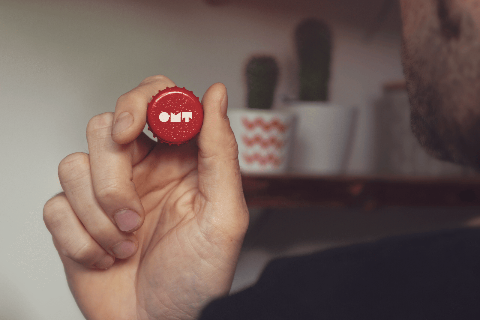
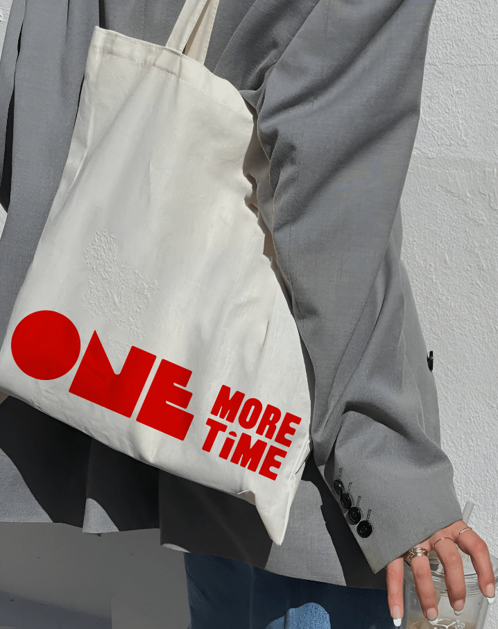
The packaging design for One More Time embodies the brand’s spirit bold, youthful, and alive with energy. Every element is crafted to reflect the raw authenticity of fermentation and the modern attitude of those who choose to live life on repeat, fearlessly and consciously. Our design language fuses vibrant color gradients, clean typography, and fluid forms that echo the natural movement of fermentation symbolizing transformation and flow. Each bottle tells a story of freshness and rebellion, inviting the consumer to take a sip, feel the vibe, and go One More Time.

