Fat Frog Branding & Design Studio, We specialize in crafting unique, high-quality packaging solutions that not only Safeguard your products but also enhance your brand’s identity.
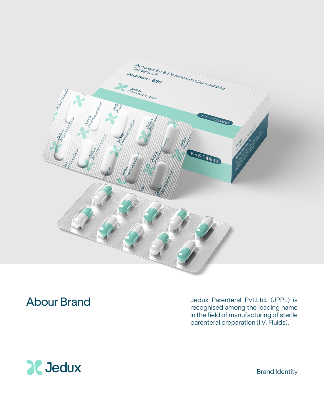
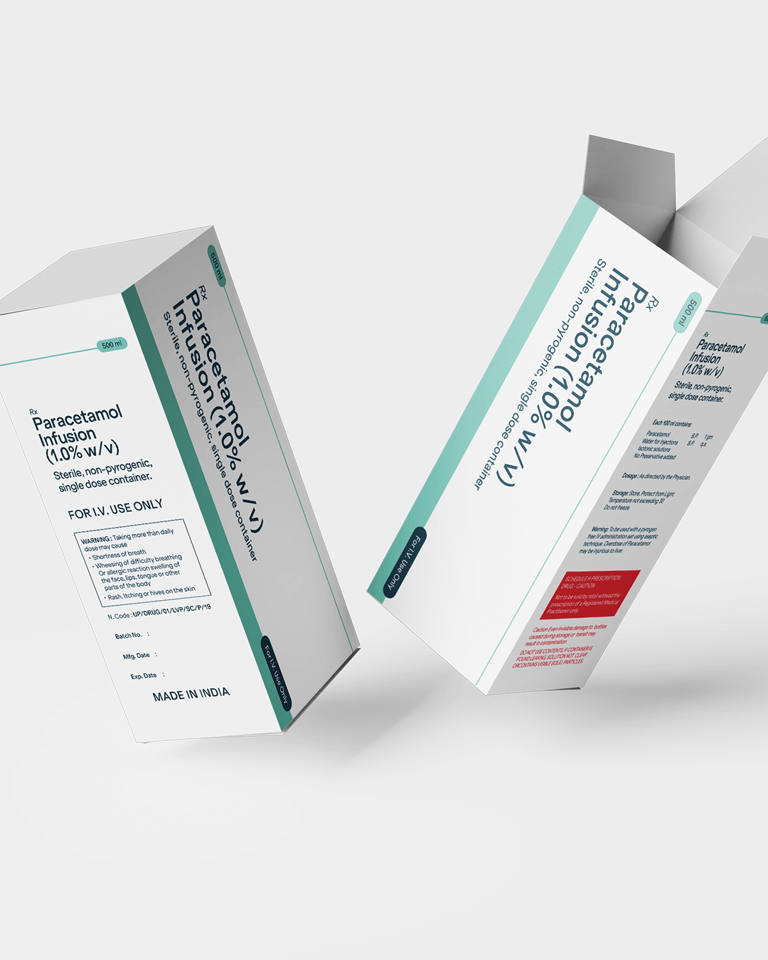
Jedux Parenteral Pvt.Ltd. (JPPL) is recognised among the leading name in the field of manufacturing of sterile parenteral preparation (I.V. Fluids). This Plant is W.H.O. GMP certified and equipped with Form, Fill & Seal machineries and Glass Bottles Machinery for LVP the containers are formed, filled and sealed in closed circuit under most aspetic condition,whitch is totally devoid of any human touch.
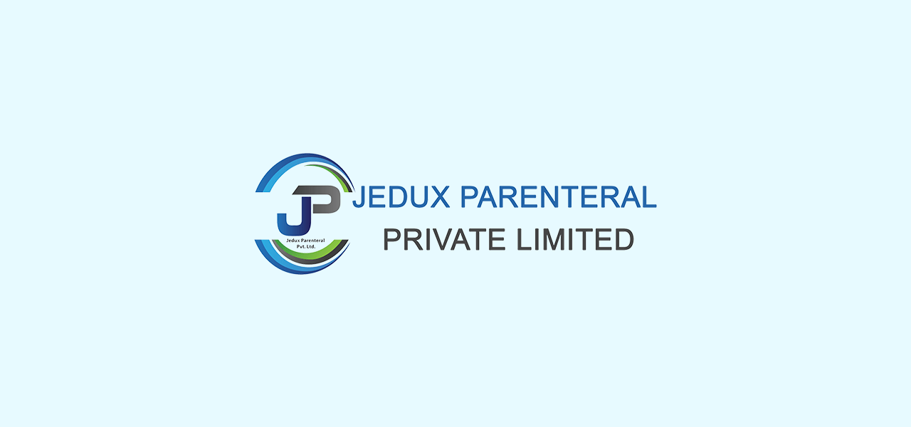
Old Identity
Complex and Overloaded Design
The combination of multiple elements (text, initials, and circular shapes) creates visual clutter, making the logo less adaptable across different applications
Inconsistent Typography
The typeface mix with lacks harmony. And the large “JEDUX PARENTERAL” in a modern font contrasts with the smaller “PRIVATE LIMITED” and the creating inconsistency.
Poor Scalability & Outdated Effects
Fine details in the circular elements and the gradient-filled initials do not scale well, making the logo harder to read at smaller sizes.
Additonally
Additionally, the metallic gradient in “JP” and the mix of blue, green, and gray tones give an outdated corporate feel, reducing the logo’s modern appeal.
New Identity Creation
Mission
Elevating Pharmaceutical / I.V Fluid Manufacturing through Quality and Innovation, with a focus on Product Diversity.
Vission
The new identity of Jedux Pharmaceuticals marks a transformative step toward redefining how modern healthcare is perceived and experienced.
Concept
This new identity is built on the brand’s core belief that healthcare should be proactive, empowering, and rooted in clinical excellence.
Visual
More than just a visual shift, this new identity reinforces Jedux’s commitment to developing formulations and wellness solutions.
Committed to cutting-edge advancements in healthcare.
Trust & Reliability
A trusted pharmaceutical partner for healthcare professionals, ensuring consistent quality and performance.
Global Standards & Compliance
Upholding the highest international quality and regulatory compliance benchmarks.
Brand Strategy
Jedux Pharmaceuticals is a standard healthcare and wellness brand committed to advancing human well-being through a science-backed, results-oriented approach. Rooted in proven pharmaceutical research and enhanced by modern innovation, Jedux delivers high-quality solutions for those who prioritize long-term health over quick fixes. Designed for health-conscious individuals, medical professionals, and purpose-driven communities, the brand fosters a culture of trust, efficacy, and continuous improvement.
Key Challenge
A key challenge for Jedux Pharmaceuticals lies in establishing a distinct and trusted identity within a highly competitive and often saturated healthcare landscape, where consumer attention is frequently drawn to overpromised, fast-acting solutions and mass-market wellness trends. While Jedux’s commitment to evidence-based, long-term health outcomes appeals to a more discerning and health-conscious audience, effectively communicating this credibility in a way that builds emotional trust and stands out visually is a significant task.
Brand Personality
Trustworthy
Reliable, consistent, and dedicated to ensuring the highest standards of safety and quality
Innovative
Focused on research and development, always evolving to meet the changing needs of healthcare.
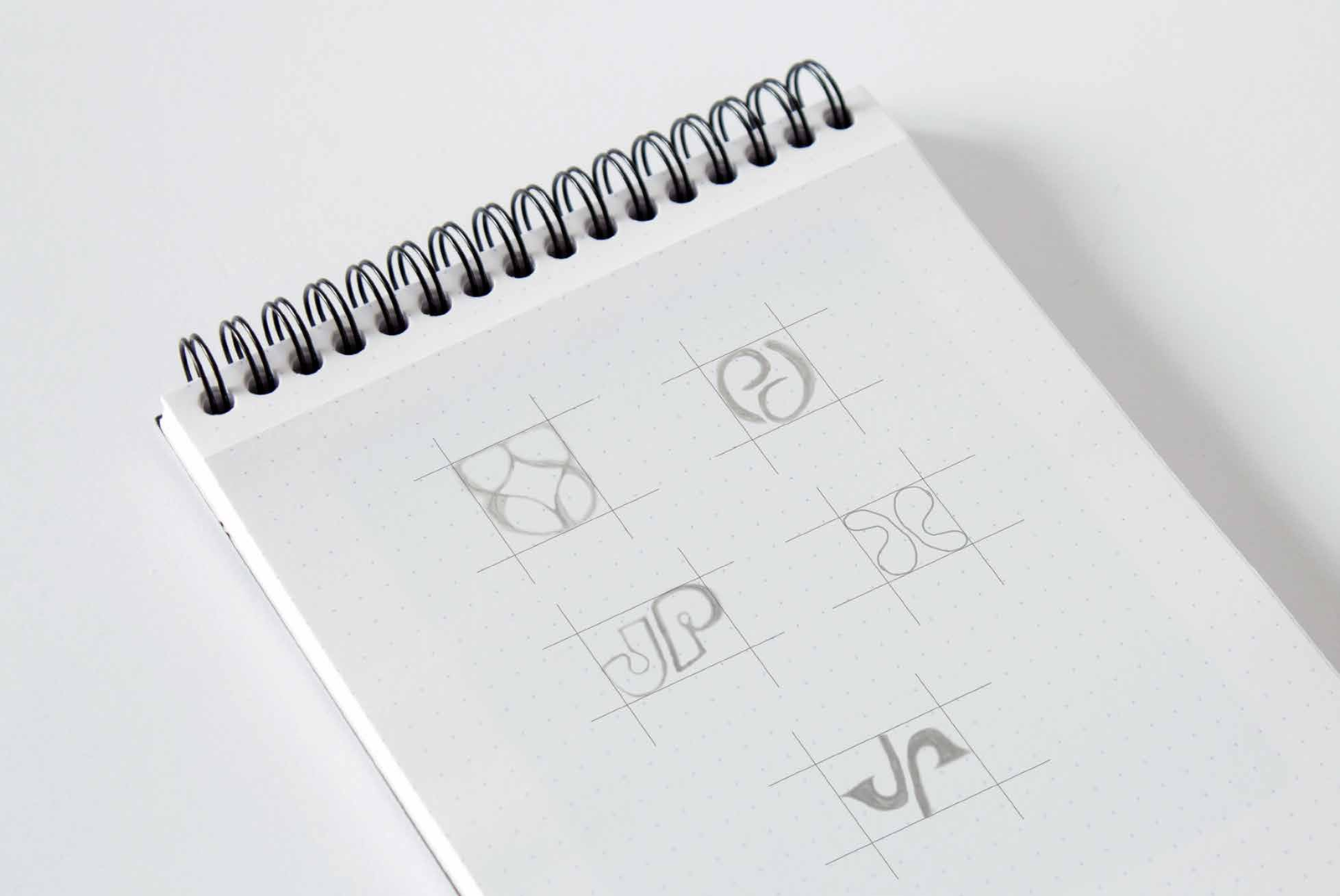
Sketching
The logo sketching phase explored various forms, typography, and symbols to create a design that reflects trust, precision, and innovation. These initial concepts helped shape the final identity of Jedux Parenteral, ensuring a balance between modern professionalism and pharmaceutical credibility.
Brand Identity Design
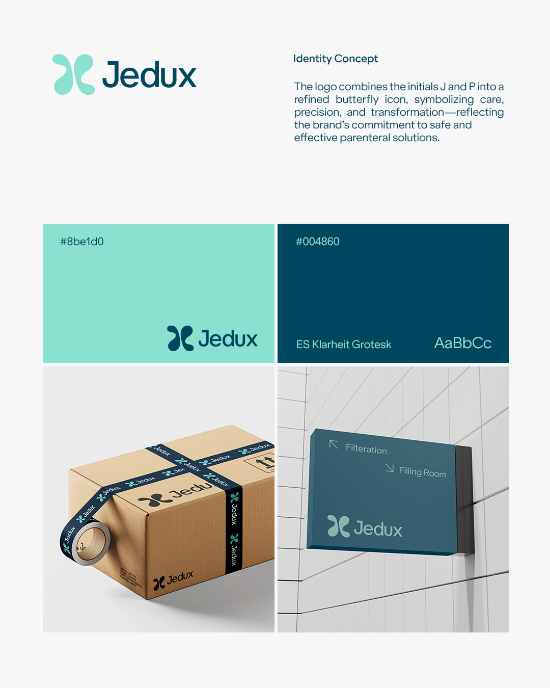
The abstract icon in the logo is inspired by a butterfly, a universal symbol of transformation and care. The butterfly symbolizes Jedux’s dedication to growth, transformation, and forward momentum, reflecting its commitment to innovation and progress. The symmetrical form conveys balance and harmony, representing Jedux’s seamless and well-structured approach.
About Jedux
Jedux Parenteral Pvt.Ltd. (JPPL) is recognised among the leading name in the field of manufacturing of sterile parenteral preparation (I.V. Fluids). This Plant is W.H.O. GMP certified and equipped with Form, Fill & Seal machineries and Glass Bottles Machinery for LVP the containers are formed, filled and sealed in closed circuit under most aspetic condition,whitch is totally devoid of any human touch.
Before / After
Jedux
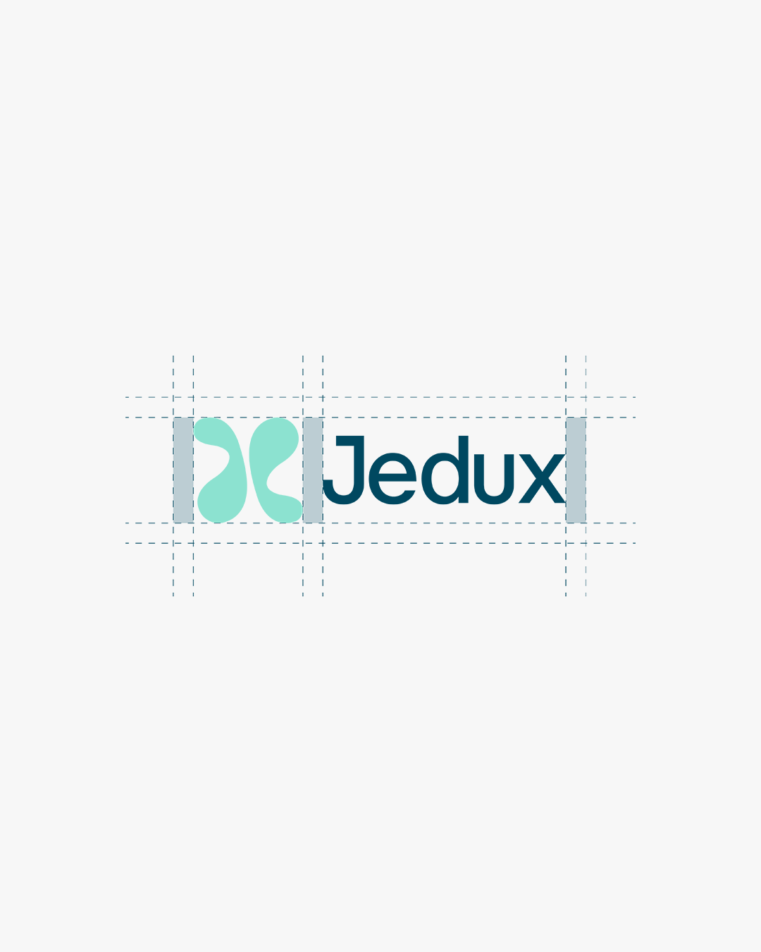
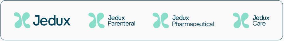
Identity Scalability
The Jedux identity maintains consistency while allowing differentiation, with the core wordmark as the foundation andsub-brands positioned below for scalability.
Structure & Proportions
The Jedux wordmark remains the primary brand identifier but is scaled down in size when used in conjunction with sub-brand names.
The sub-category name (e.g., Parenteral, Pharmaceutical, Care) is placed directly below the Jedux wordmark.
The sub-brand name follows the brand communication typeface, ensuring visual consistency across all touchpoints
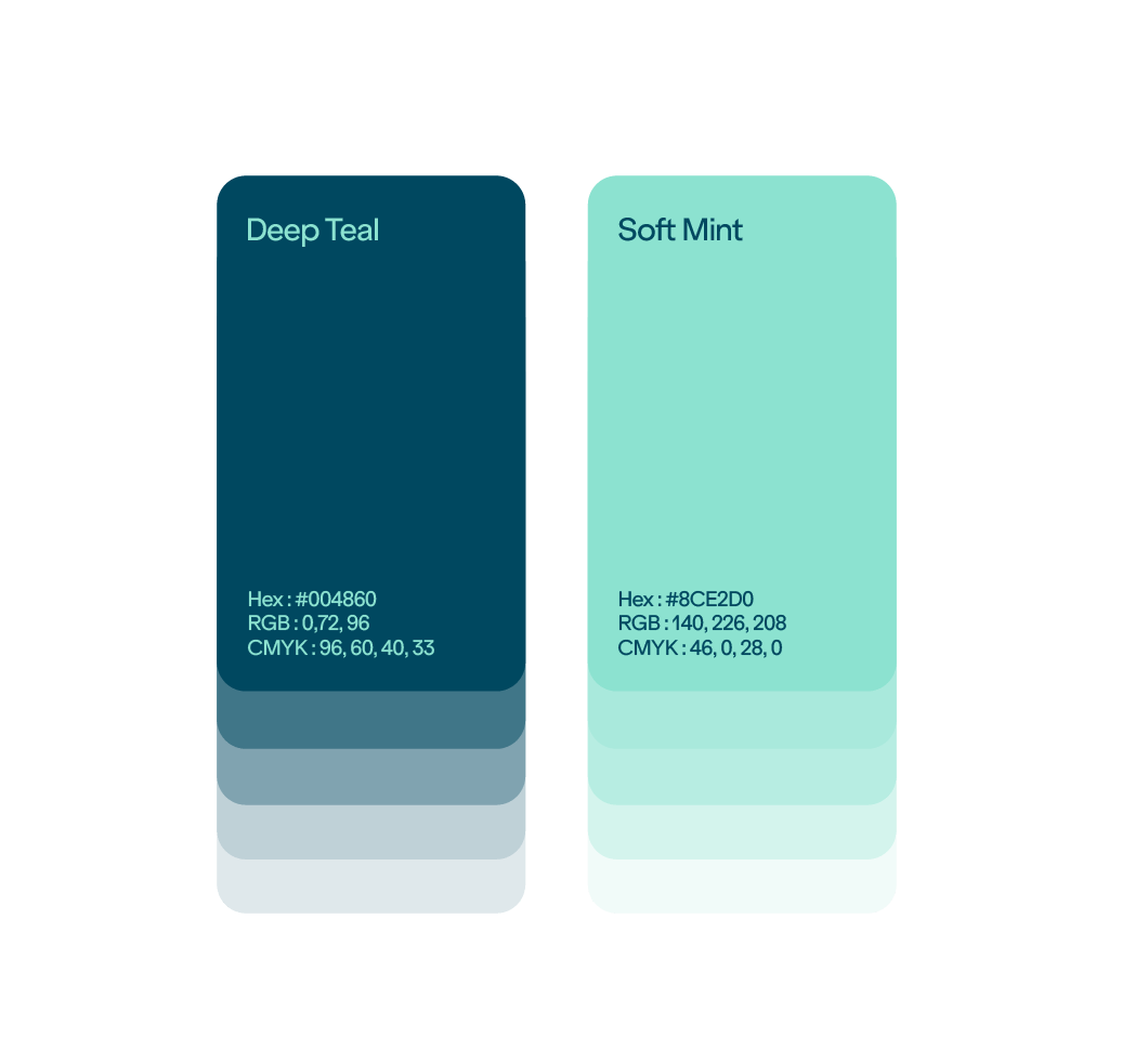
Colour Palette
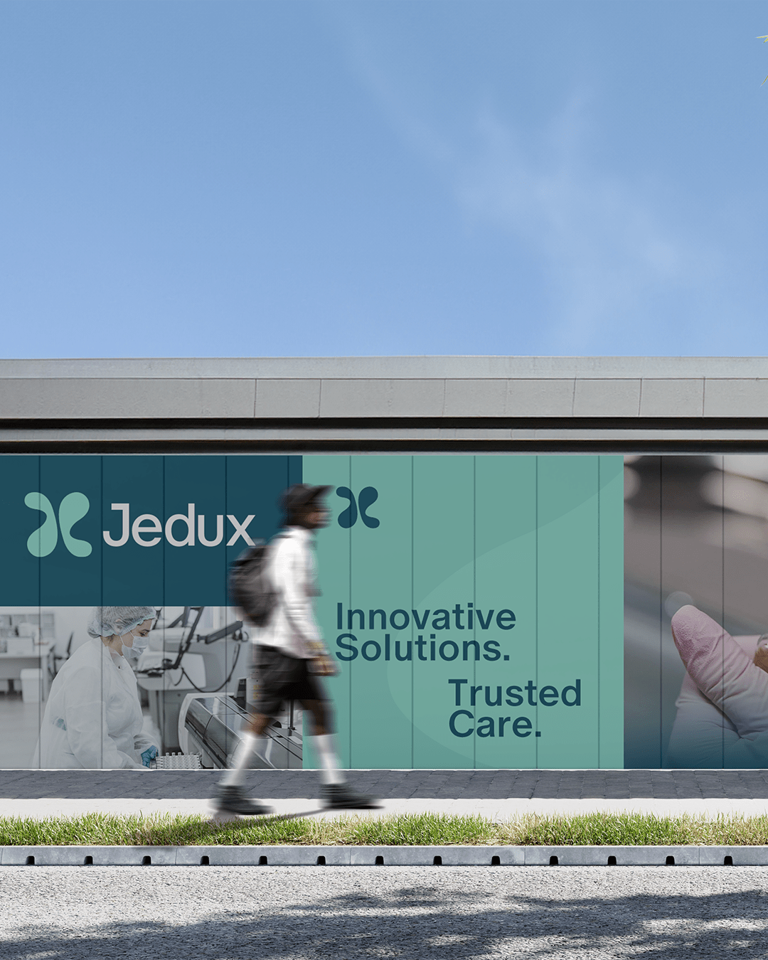
The Jedux color palette is carefully curated to reflect the brand’s core values: professionalism, innovation, trust, and care. The palette blends deep, grounded tones with lighter, more refreshing accents, creating a modern, approachable visual identity that appeals to a wide audience.
Deep Teal (#004860) (Primary Colour) : This rich shade represents trust, stability, and professionalism—values central to Jedux. It’s bold, yet approachable, ensuring the brand stands out as an authority in its field while remaining user-friendly.
Soft Mint (#8CE2D0) (Secondary Colour) : Soft Mint brings a sense of innovation and care. It balances the deep tones with a fresh, modern touch, evoking creativity and a user-first approach that aligns with the brand’s vision.